[
Date Prev][
Date Next][
Thread Prev][
Thread Next][
Date Index][
Thread Index]
[
List Home]
|
[platform-ui-dev] Suggestions for improvement.
|
Thanks for the great work everybody is doing!
I have worked with Eclipse since 2M6 and it is, or will be, the best
tool around. Below are some suggestions
that could improve the usability.
I could modify some of these existing views myself if I only get some
pointers from the seasoned Eclipse developers.
UI - general
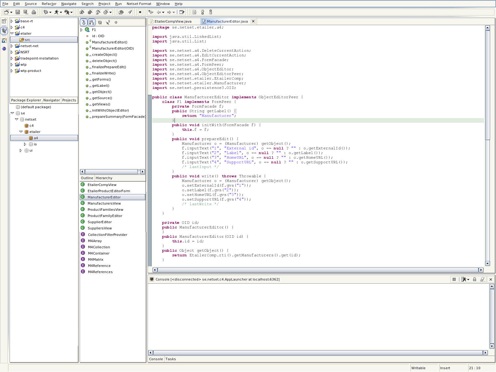
It would be nice if the title bar of some of the views could be hidden.
That way I could build a perspective which
would better reflect the way I see code. See figure 1. Notice that the
title bars of Outline, Types etc have been hidden.
There seems to have trickled in a small bug when using Gnome (Fedora Core 1)
When switching to full screen mode the dialog boxes that appear are also
in full screen mode. That wouldn't be
to bad if they weren't hidden behind the main window :)
Is this a bug in Gnome? The functionality is outstanding since I am
finally able to use all available screen estate.
This used to work until I upgrade gnome to 2.4 I think.
The tabs for the stacked views are placed below the view but the "click
distance" if often shorter if they are placed
at the top.

Packages view:
The package name filter would be more powerful with a regexp. Often I am
interested in working with a certain
set of packages. The selection is easily expressed using "show only"
type of query.
It would be nice if it could display packages from more than one project.
It would be nice to be able to filter out only the packages that contain
source. The packages from 3'rd party
jars are often of less importance than the code I am working on right now.

Types - view
There doesn't seem to be possible to create 2 instances of Types view
with different settings. I would like to make a view that displays
interfaces first, then classes. This could be also be solved with a new
sorting option although several instances
of the same view with slightly different filters and settings would be
more flexible.
Stacking
As you can see from figure 1 I have stacked the outline and hierarchy
view. It seems like the object in focus for
the outline should also be focus for the hierarchy view. A switch to
hierarchy will show a different view of the current
object.
It is maybe just me but I see the stacking functionality as a fast way
to switch between different views
of the same object/collection of objects.

Keyboard navigation improvements
"Right arrow" in project navigator the view could focus on the package
explorer.
"Right arrow" in Package view focus on Types would be nice.
"Right arrow" in Types view focus on Outline view.
"Left arrow" would go "backwards"

Keep up the great work!

Attached draft-1.png


