[
Date Prev][
Date Next][
Thread Prev][
Thread Next][
Date Index][
Thread Index]
[
List Home]
|
[ice-dev] Fw: ICE logos, icons, etc.
|
|
Everyone,
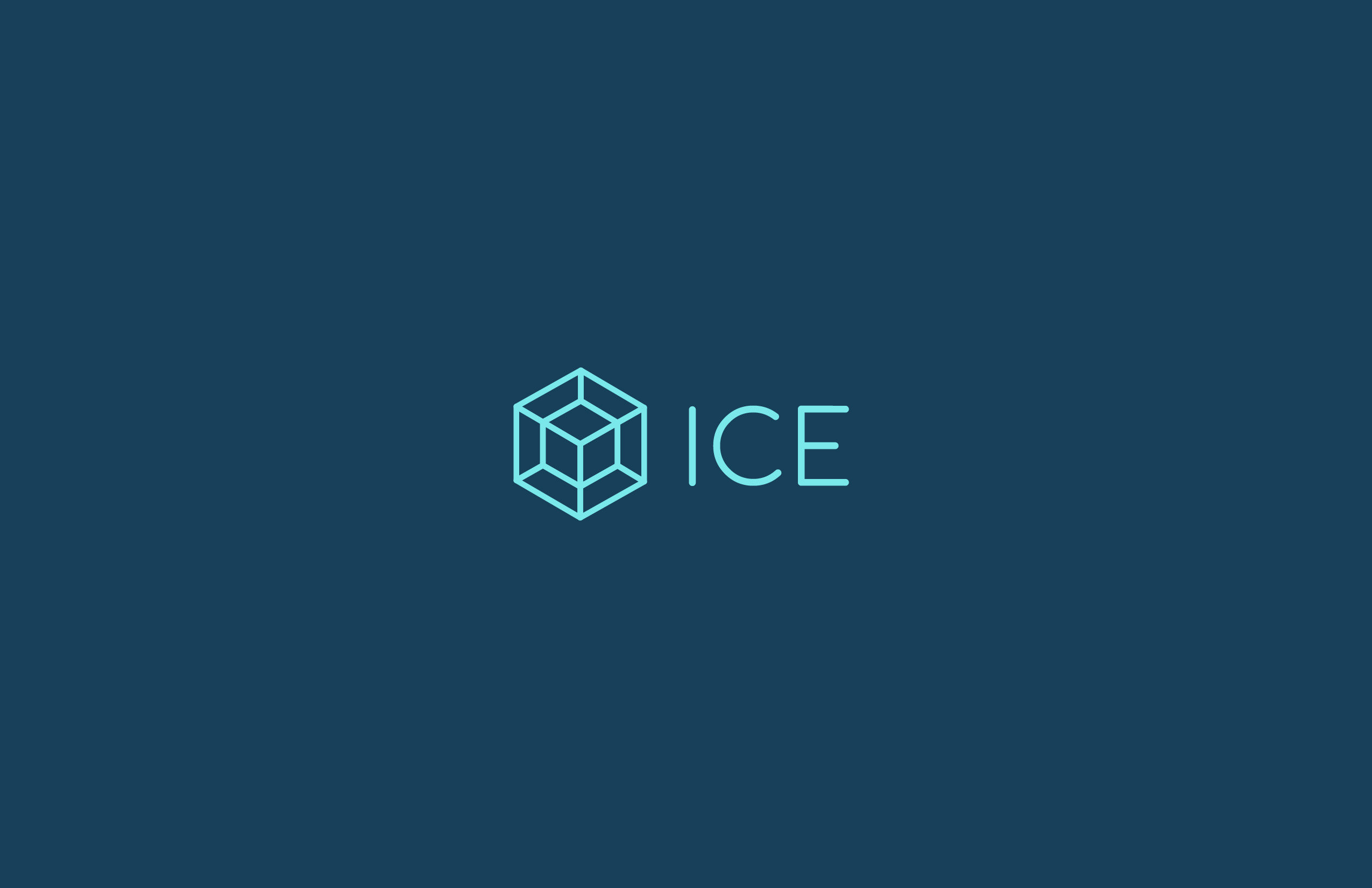
Please see Adam's email below and let us know what you think about his proposal for the new ICE logo.
I like it and want to go with it, with my only proposed change being to make the tesseract and word "ICE" bigger. (Cut away more of the empty space.)
Jay
Jay Jay Billings
Oak Ridge National Laboratory
Twitter Handle: @jayjaybillings
From: Malin, Adam B.
Sent: Monday, October 03, 2016 8:48 AM
To: Billings, Jay Jay
Subject: Re: ICE logos, icons, etc.
Hey Jay Jay,
Hope you had a great weekend! I was thinking over the weekend about the idea of making the ICE logo a “tesseract”. This would give the logo a scientific element while keep the ice cube
shape. Also hinting at the idea of a fourth dimension for those who know what a tesseract is. I like the wire frame look as well because it reminds me of a computer simulation.
Take a look and let me know what you think.
Thanks!
Adam Malin
www.adammalin.com
|
Attachment:
ICE LOGO 2.jpg
Description: ICE LOGO 2.jpg